Google Play store is one of the most important Google services which has been used by millions of users each day. However, this app had a really boring and outdated user interface which kills all the fun of the users. However, the company has changed, they just released a revamped version of the Google Play store. The all-new version of the Google Play comes with a more white-ish and simple UI which improves usability and the overall appearance of the app.
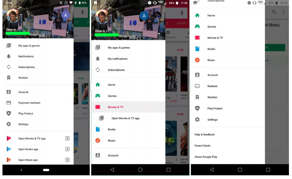
There are many small changes in the UI elements everywhere the app interface. However, the first thing we’ve noticed is that the navigation drawer is now exclusive to apps and games while shortcuts to the media apps like Play Movies & TV and Play Music are moved in the hamburger menu right underneath Settings.

While users can still quickly open the dedicated Play Movies & TV, Books, and Music apps from the nav drawer, they can no longer quickly jump to browsing or buying media. In fact, these new shortcuts have been moved to underneath Account, Payment methods, Play Protect, and Settings. If we look around, we can see the bright UI theme in line with the Material Design language, which Google has been working on for years. The “My apps & games” and the “Settings” menus are now in white color. Previously it was in a green layout.
The latest version of the app is 12.6.13, it contains several UI changes and improvements that focuses mostly on the user experience and many other UX factors. Also, Google has used most of their material design language in the new Google Play store app version. At the same time, they removed all unwanted options and features that kills the user experience.

